
Leisure Painter The Artist – September 2026
Summary
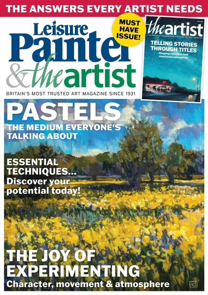
Diane Griffiths's Driving Home takes the cover of The Artist September 2026, where her feature Telling stories through titles at page 36 argues that a painting's title shapes interpretation, hints at narrative and builds an emotional connection before the viewer has looked properly.
Soft pastel runs through the issue. Richard Suckling shares his experiments combining pastel with other media at page 8, Steve Hall explains how modern pastel surfaces changed his approach at page 31, and Catherine Beale reimagines watercolour through unified washes and watery reflections at page 24. Sarah Middleton turns to Claude Monet at page 28.
Exhibitions carry the front section. Hilma af Klint: Artist and Visionary brings 79 works to the National Gallery of Ireland from 15 October 2026 to 7 February 2027, Clare Woods shows 29 recent works at Pitzhanger Manor & Gallery until 8 November, and Pre-Raphaelites: Art and Poetry opens at the Laing Art Gallery in Newcastle upon Tyne on 17 October.
—————
Content Guide
▸ Cover Story
p.36 · Telling stories through titles
Diane Griffiths explores how the titles artists give their work shape interpretation, hint at narrative and create an emotional connection with the viewer. Her own Driving Home holds the cover, which puts the argument and the example on the same issue. The piece treats naming as a decision rather than an afterthought. Look at the titles on your own next three paintings before you sign them.
▸ Techniques
p.8 · The joy of experimentation
Soft pastel artist Richard Suckling shares his experiences of combining pastel with other media. The piece is about what happens when one medium stops behaving, rather than about tidy results. Experimentation is framed as practice rather than play. Set up one pastel with an incompatible medium and let it fail on purpose.
p.24 · Reimagining watercolour
Catherine Beale focuses this month on unified washes and watery reflections. Two specific concerns make the column usable rather than general. Unified washes are the harder of the two, and Beale treats them as a problem with a method. Run one wash across a whole sheet without touching it again.
p.28 · Learn from the Masters
Sarah Middleton shares her passion for Claude Monet and explains how one of his paintings gave the Impressionist movement its name. The named painting is the hook, and Middleton works from it outward. Copying a master is treated as analysis rather than imitation. Paint one passage from that Monet and compare your handling of the light.
p.31 · Building landscapes with light and colour
Steve Hall explains how modern pastel surfaces have changed his approach. The subject is the support rather than the pigment, which is where most pastel writing starts and stops. Newer surfaces let him build differently, and he says how. Try one modern surface next to your usual paper and note the difference in layering.
p.41 · Is Notan a form of art or a design tool?
Bob Brandt explores how tonal studies can help strengthen composition while revealing the limitations of working without colour. The question in the title is answered rather than deferred. Notan is treated as a working method with a cost. Make three tonal studies of one subject before you commit to colour.
▸ Features
p.15 · Painting momentum
Mike Barr writes about one of the most important things in an artist's life. The piece is about sustaining output rather than inspiration. Momentum is treated as something you build, not wait for. Set a minimum daily mark and keep it for a month.
p.16 · Creating place in semi-abstract landscapes
Caroline Saunders talks to Michael Hill about the importance of evoking sensory experiences as a work moves toward abstraction. The conversation format lets two painters disagree in print. Semi-abstraction is treated as a threshold rather than a style. Work one landscape further from the literal than feels comfortable.
p.4 · Dear diary
Robert E Wells continues with part seven, from red lips to red buses. The serialised diary format gives the issue a continuing voice. His painting Eros measures 36 by 36 inches, or 91.5 by 91.5 centimetres. Read the earlier instalments if the running references confuse you.
▸ Exhibitions And Regulars
p.4 · The art world
The section gathers the month's highlights in the art world, with news, information and online events. It is the issue's listings page and the place to check dates. Hilma af Klint's Sunrise, 1907, oil on canvas at 95 by 60cm, comes to the National Gallery of Ireland from 15 October 2026 to 7 February 2027 with 79 works. Diarise the Dublin opening before it closes.
p.45 · Book reviews
Henry Malt selects this month's choice publications. Book coverage is rare in practical art titles, which makes the slot useful. It tells you what the magazine considers worth reading alongside painting. Order one title rather than skimming the page.
p.46 · Coming next month
The October 2026 issue's highlights are previewed. Previews let you decide whether to subscribe rather than buy singly. Check whether next month's features match your medium before ordering.
—————
Editor's Take
Diane Griffiths's cover feature earns its place by treating titles as an actual decision, and her own Driving Home on the cover makes the argument self-demonstrating. The pastel content is the issue's real strength: Richard Suckling on combining media, Steve Hall on how modern surfaces changed his method and Bob Brandt asking whether Notan is art or a design tool give three distinct positions rather than one house view. The exhibition listings are unusually precise, with Hilma af Klint's 79 works, dates and Sunrise at 95 by 60cm. The weakness is that several promised pieces cannot be read properly here, and the issue leans heavily on soft pastel and watercolour, so acrylic and oil painters get little. Dear diary's part-seven serialization assumes you have the back issues. Best for pastel and watercolour painters.
Strengths
• Three pastel pieces take genuinely different positions on medium, surface and tone
• Griffiths's title feature is demonstrated by her own cover painting
• Exhibition listings give work counts, dates and catalogue dimensions
Weaknesses
• Heavy pastel and watercolour bias leaves oil and acrylic painters thin
• Dear diary part seven assumes access to earlier instalments
Verdict: Recommended — the pastel coverage and Griffiths's title feature outweigh a narrow medium range.
