
Paint Draw – Animals – 6th Edition – 13 November 2025
Summary
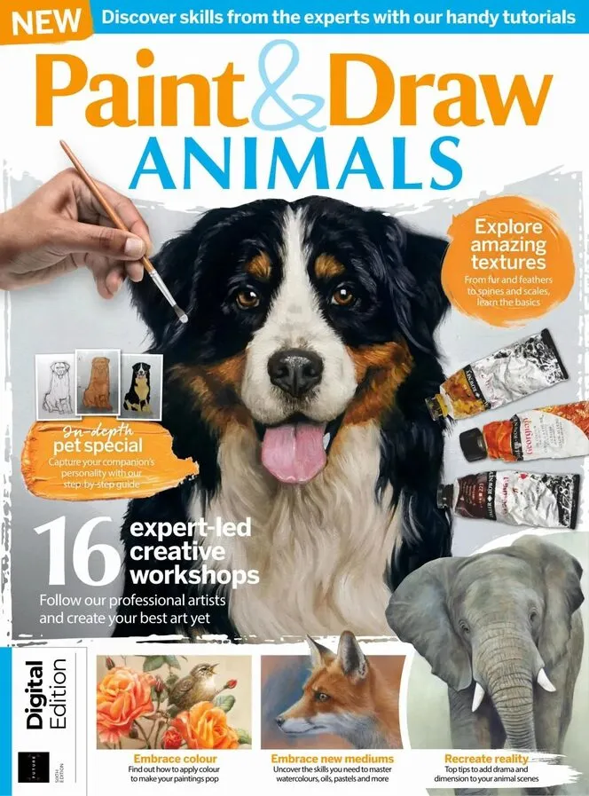
Paint&Draw Animals returns for a sixth edition with 16 expert-led workshops, including Wrendale Designs founder Hannah Dale painting a running hare in watercolour and Kate Oleska's 16-page, three-part pet portrait masterclass in oils, plus texture guides covering fur, feathers, scales and spines — practical training for anyone learning how to draw and paint animals.
The opening Basics section packs eight skills into 24 pages. Jill Tisbury dissects animal eye anatomy and builds a Scottish wildcat's dense fur in three pastel layers, while Ivan Jones — a retired veterinary surgeon — renders bird feathers with Derwent and Cretacolor pencils on Canson Mi-Teintes Touch. The centrepiece is Lancelot Richardson's eight-page texture masterclass, which works through shells, carp scales, hippo hide, frog skin, wool, feathers and tenrec spines with one governing idea: texture reads clearest at light-shadow boundaries.
The tutorial lineup then splits by medium. Kate Osborne paints bees and butterflies wet-in-wet, printing wing details through kitchen tissue; Hannah Dale of Wrendale Designs brings a running hare to life in Winsor & Newton watercolour; Alex Egan floats koi carp across a Prussian Blue wash. Pastel painters get Kaz Turner's tiger on Anthracite Pastelmat, Rebecca de Mendonça's Arabian horse and fox, and Jill Tisbury's Chinese leopard on velour, while Tony Forrest closes with cheetah oils built on warm light against cool shadow.
The 16-page pet special anchors the back half. Melanie Phillips shades Poppy the dog on Fabriano hot-pressed paper with three pencil brands, then Kate Oleska spends three parts painting a Bernese mountain dog in oils on gessoed MDF — from a charcoal sketch mapped with circles and guidelines to fur edges dragged into a wet background. The contents page also promises an elephant in acrylics, plumage in eight steps and a flamingo built on negative shapes.
—————
Content Guide
▸ Basics: Textures & Tools
p.8 · How to illustrate animal eyes
Jill Tisbury works a leopard eye in pastel pencils on Pastelmat and starts with anatomy: the lacrimal gland ridges the fur above the eye, casting the shadow that forms the brow. She warns against centring the pupil — the eyeball is a globe, not a flat disk — and notes that a perfectly round white dot only appears under a cloudless sky. Reflections usually contain trees, so she paints blue sky and a cloud band into the iris over ochres. Fill a sketchbook with eye studies before attempting a full portrait; judging iris values against surrounding fur is the other half of the job.
p.12 · Capture bird feathers
Retired veterinary surgeon Ivan Jones renders feathers in soft pastels plus Derwent and Cretacolor pencils on Canson Mi-Teintes Touch. He blends each feather's base colour with a polystyrene stick cut to a pencil shape, then strokes from the feather edge toward the middle with three shades — light, medium and dark — because one side always catches more light. Darkest values sit under each feather. He finishes with Cretacolor white along the central quill, chosen because it sharpens well and gives the truest white available. Copy the three-shade system and feather groups read as three-dimensional.
p.18 · Learn to use proportional dividers
Jill Tisbury defends the proportional divider, a tool many artists avoid. Set the pivot to your scale — the centre hole is 1:1 — print a greyscale reference to draw on, then mark a dot at each key point to build a dot-to-dot map. Place one divider point on the frame edge and the other on your dot, transfer both measurements to the drawing page, and mark where the crossed lines land. The method stays far less intrusive than scaling up with a grid, and as confidence grows you need fewer dots.
p.22 · Master textures
Lancelot Richardson spends eight pages on shells, carp scales, hippo hide, amphibian skin, wool, feathers, meerkat fur, bearded dragon scales and tenrec spines, across graphite, gouache, ink and Conté. His core rule: you only read texture clearly in well-lit areas, especially at light-shadow boundaries, so never darken lit zones with marks meant as texture. Detail a few key areas and the eye completes the rest — draw the shadow shapes between feathers and the feathers appear. His carp scales overlap like roof tiles from head to tail, with thick white gouache for iridescent highlights.
▸ Tutorials: Watercolour & Ink
p.40 · Creative colour with ink
Jill Tisbury pushes Brusho, a concentrated watercolour ink powder, through a parrot painting. She draws first in permanent ink, protects whites with masking fluid and a wax crayon, then wets the paper and sprinkles dry pigment so it blooms — no two results match. Detail on the beaks and feet comes from pigment mixed with water and worked like watercolour, light to dark, with pure pigment touched into damp paper for the strongest colour. Her storage tip: punch holes in a tub lid with a darning needle and shake the powder like a salt cellar, testing strength on scrap first.
p.42 · Make spontaneous bees and butterflies
Kate Osborne paints after studying drawer-loads of specimens at Brighton's natural history museum, and keeps everything wet. Bees start as Cadmium or Hansa Yellow puddles; brown drops in behind, and you mop with clean water to push yellow away from the wings. Butterflies get painted through kitchen tissue — press it into wet paint, peel before fully dry for crumbling wing edges — then torn masking-tape stripes for wing detail and tissue circles glued on as wing spots. A sword brush paints the veins; a round brush flattened into a comb does body hair.
p.48 · Tips to paint a mischievious hare
Hannah Dale, creator of the Wrendale Designs giftware brand, paints a running brown hare in Winsor & Newton pans on 300gsm cold-press paper, working at the kitchen table in fragmented sessions. She opens with quick pastel compositional sketches, lays a warm base of Burnt Sienna and Yellow Ochre, then contrasts it with violet, French Ultramarine and Burnt Umber for shadows. Fur is implied with dry-brush layers rather than individual hairs, and she checks progress in a mirror to spot errors with fresh eyes. Her rule for the eye: the lightest and darkest values of the whole painting should sit side by side inside it.
p.54 · Capture movement with loose brushstrokes
Alex Egan paints koi carp on watercolour stretched with gum tape onto a board, starting with big flat brushes precisely to limit control. The background goes down fast in diluted Prussian Blue and Sepia, leaving the fish as white paper; ripples come from alternating wet and dry brushwork. A limited palette — Winsor Lemon, Cadmium Yellow, Cadmium Orange, Vermillion, Payne's Gray — builds the fish, with a soluble pencil restoring outlines the wash erased. She darkens the background in a second pass to push the fish forward, then spatters white gouache for movement, stopping before the piece overworks.
▸ Tutorials: Pastels & Oils
p.60 · Produce striking contrast with pastels
Kaz Turner paints a tiger on Anthracite Pastelmat 360gsm, starting at the eye and establishing the black stripes in advance so the white fur drops over their edges. Hard Conté sticks underpaint the darks before pastel-pencil detail; greens and greys keep the shadowed oranges luminous. For whiskers she presses an indent into the paper with a blunt tool so pastel skips the groove, or draws them with Conté 630 White, an oil-and-clay pencil that holds a heavy line. Her contrast rule: light areas get worked first, and tonal difference — not colour choice — makes fur read as three-dimensional.
p.72 · Create a striking image on velour
Jill Tisbury tackles a Chinese leopard on velour, a divisive surface she defends for holding many layers. The reference was shot by her husband at the Wildlife Heritage Centre in Kent — rights secured with homemade cakes. She paints the background first in Burnt Umber and Madder Brown to judge the cat's colour balance, blends edges with a hard colour shaper for shallow depth of field, then builds the fur in four passes: darks, lights, midtones, detail. Eye highlights are pale blue with white, matching the sky the cat was looking at — copy what the reflection actually contains.
p.78 · Draw a fox using pastels
Rebecca de Mendonça primes mount card with Art Spectrum Colourfix in White, Burgundy and Raw Sienna, brushing in the direction of the fox's coat so the ground colour supports the fur. Charcoal sketches first because it erases; forgiving Conté crayons lay in Burnt and Raw Sienna tones; a broken black Conté gives sharp edges for eyes and nose. Muted blues surround the warm head to push it forward, softened with an eraser. For wiry neck hair she flicks Unison lilac-grey, charcoal and cream over each other and leaves the last layer unsmudged. Practise whisker flicks on scrap — thicker at the base than the tip.
p.84 · Add dramatic light to your wildlife paintings
Tony Forrest has painted African wildlife for nearly 30 years and here lights a cheetah in oils on 10x12in stretched linen, using Liquin throughout. The method is temperature, not detail: a warm mid-orange of Cadmium Yellow, Cadmium Orange and Titanium White for sunlight, calmed with Ultramarine, with strong cool colour in the shadows from the first block-in. White never appears in the fur — the palest areas stay orange-yellow — and black is banned from shadows. Backgrounds stay loose, a filbert dragging thick paint to suggest foliage. Check the sunny effect is unmistakable by step four; rub off with a rag if it is not.
▸ Pet Portrait Special
p.30 · Improve your pencil shading
Professional pet portraitist Melanie Phillips draws Poppy on Fabriano hot-pressed watercolour paper, a surface she has used since visiting Italy in 1994, with HB, 4B and 6B pencils from Derwent, Staedtler and Faber-Castell. She starts at the eyes to bring the dog alive early, shades the negative spaces, and lifts unwanted tone with a putty eraser moulded to a point. Layers go in gradually with a sharp 4B rather than hard pressure, and whiskers come last. Her stopping rule: stand back, compare with the photo, then set the drawing aside for two days before fiddling further.
p.90 · Paint a pet portrait
Kate Oleska opens a 16-page, three-part oil masterclass with a Bernese mountain dog, gessoing MDF board in four thin sanded layers instead of buying canvas. The sketch phase runs 15 steps: a circle for the head, eyes on a line two-fifths from the top, guidelines from the eye corners to place the nose, and all three coat colours mapped before sealing. Part two paints the head — irises darkened at the top, tongue toned with Cadmium Red and white — and part three drags black fur sideways into the wet background for soft edges. Choose reference photos shot at the pet's eye level, sharp and well lit.
—————
Editor's Take
The texture masterclass is the strongest thing here — Richardson explains why marks work, not just where to put them, and that thinking transfers to any subject you attempt. The pet special earns its cover billing too: Oleska's three-part structure surfaces decisions (gessoed MDF over canvas, eyes placed two-fifths down the head circle) that most tutorials skip. The weakness is repetition — five pastel workshops cover similar fur-rendering ground, and Jill Tisbury appears four times, so the issue leans heavily on a small roster of UK regulars. Nothing here is aimed at abstract or experimental artists; every demo is representational and photo-referenced. For a hobbyist who wants to paint their dog convincingly, buy it. For a gallery-level wildlife painter, most of this will read as revision.
Strengths
• Lancelot Richardson's texture guide explains the logic of marks across nine animal surfaces
• Kate Oleska's 16-page, three-part pet portrait covers surface prep through final fur edges
• Material lists name exact brands — Pastelmat, Unison, Conté 630, Fabriano — so readers can replicate results
Weaknesses
• Five pastel workshops overlap heavily on fur technique, padding the tutorial count
• No digital or mixed-media coverage; every demo is traditional and photo-referenced
Verdict: Recommended — Strong texture theory and a genuinely deep pet-portrait course outweigh the pastel repetition; best value for hobbyists painting from photos.
